Showing posts with label book covers. Show all posts

Saturday, 1 February 2020

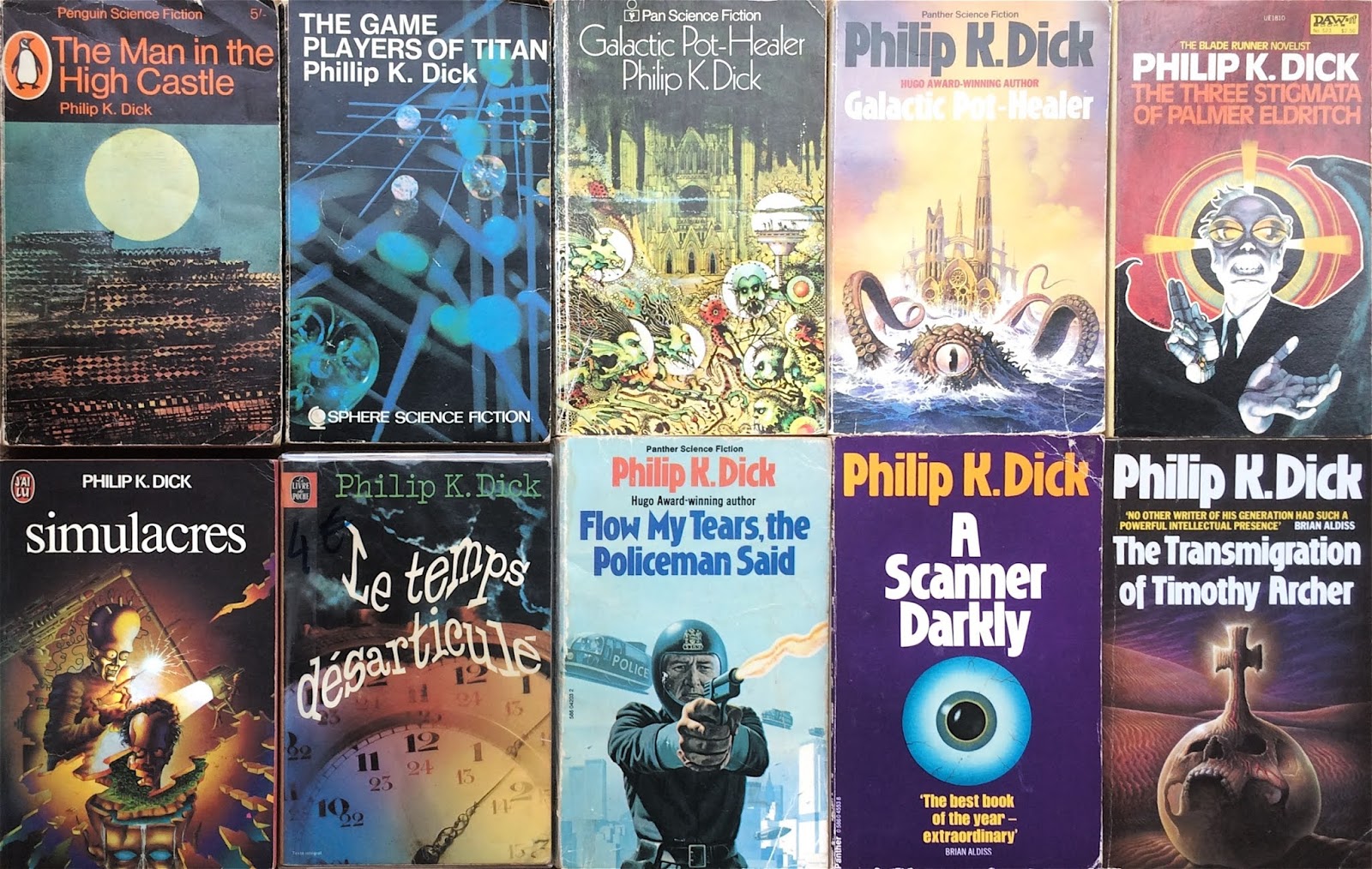
The Misleading Book Covers of Philip K. Dick

Though today widely admired for their psychological complexity and visionary insights, the novels of Philip K. Dick were published in his lifetime as standard science fiction. That is to say, cheaply and with no regard to the artwork – the generic formula of ray-guns, rocket-ships and space-battles was applied indiscriminately to his work. In the late 1950s, his first books were issued in then-popular double editions; two novels ‘back-to-back’ with interchangeable artwork by anonymous artists. Even when published individually, their packaging remained in the cost-saving pulp tradition, as befitted their status as genre fodder in the years before Dick’s critical acclaim. This applied to the UK as well as the US paperback industry, with British imprints such as Granada and Grafton, Pan and Panther turning out re-issues using the same regulation artwork.


While the pulp SF market was resistant to change, having employed the same methods successfully since the inception of the genre, Dick’s work gradually gained more literary credibility, especially in Europe. The production values of several foreign-language editions suggested an attempt to capture some of the depth which critics were beginning to detect. By the end of the 1960s and early 70s, though Dick himself had already written the bulk of his novels, the seeping of the counter-culture, the esoteric and the experimental, into the mainstream was apparent. The influences of pop-art, psychedelia and surrealism began to be manifested on book covers, with Philip K. Dick ripe for such treatment. The US Daw edition of 1965’s The Three Stigmata of Palmer Eldritch, a favourite of John Lennon’s, is a classic of its type; no wonder the German translation of the same book was rendered as LSD-Astronauts


Sadly Dick died in 1982, on the cusp of wider recognition, shortly before the release of Blade Runner brought his work to a whole new audience. Based on his 1968 novel Do Androids Dream of Electric Sheep?, the film’s success gave rise to an ongoing succession of lavish Hollywood adaptations. From Total Recall to Minority Report, several of the novels and stories which inspired them have since been given the ‘movie tie-in’ cover. Richard Linklater’s 2006 film of A Scanner Darkly, an ambitious ‘rotoscope’ animated version of Dick’s dystopian vision of societal breakdown and drug-induced paranoia, was also issued as a graphic novel. However, since his death, few publishers have surely even considered issuing Philip K. Dick’s novels with illustrations of rocket-fire and spaceships.


Friday, 27 February 2015

Another Cover Without a Cause

Continuing the theme of hopelessly misjudged science fiction book covers, I recently picked up a copy of Richard Matheson's short story collection, Shock! As the author of I Am Legend, a regular contributor to The Twilight Zone, and the creator of the stories which were filmed as The Incredible Shrinking Man and Duel, Matheson was a multi-faceted and versatile writer, blending elements of science fiction, horror and fantasy to original effect. The 'shock' in his work is generally of a psychological nature. However, when British paperback imprint Sphere came to re-issue his early short story collection of that title, they commissioned cover art (by an artist who, perhaps wisely, remained anonymous) spectacularly lacking in subtlety: an axe splitting a bloody skull...


It transpires that a similar artistic formula was employed for the remaining story collections in the series, which can be viewed on the Vault of Evil blog. Matheson's response is sadly unknown.

Monday, 26 January 2015

Covers Without a Cause: SF Cover Illustrations

To complement the surreal selection of 70s SF album covers from earlier this month, I decided to post on SF book covers... with a twist. The titles I’ve chosen are ones where the subject depicted on the front of the book has little, if any, resemblance to the story of the novel. It’s a problem that’s plagued pulp fiction generally but particularly SF; the mass production of cheap books from the 1940s onwards demanded a high turnover of titles, with publishers’ in-house artists usually working to a brief following the established formula of spaceships and aliens. However, the passage of time has given some of these books a certain charm, or at least enough entertainment value to raise a smile.

The three covers featured here are a somewhat piecemeal selection, and the tip of the iceberg in terms of the SF genre but a good starting point that will perhaps spawn a sequel post. Here goes...


1. Dagon and Other Macabre Tales by H.P. Lovecraft. Highly influential in the SF, fantasy and horror genres, the stories of Lovecraft offer plenty of terrifying visual fodder, or so you might think. The cover design for this Mass Market Paperback edition (1985) of his collected short stories shows an odd, brown scaly creature (not, to my memory, resembling anything in the stories) sitting on top of an unconvincing pile of disembodied heads. Maybe the artist assumed the title was a typo, since the creature’s appearance is definitely more dragon than Dagon.


2. The Hospital Ship by Martin Bax. The first (and only?) novel by the writer and consultant paediatrician, Bax’s experience as a doctor informs this tale of post-apocalyptic societal collapse. The hospital ship of the title sails around picking up casualties of recent wars, a futile undertaking that does little to mitigate the impending global disaster. Clearly, it’s a gloomy theme, and one that could use some help exciting a reader’s attention. So it’s the old sex sells cliché that kicks in for the Pan Books edition (Picador imprint, 1977). Even allowing for the tenuous link to the practice of ‘love therapy’ in the novel, the cover (and the covergirl) are pretty wide of the mark. And if you bought the book for the cover alone, you were bound to be disappointed with the contents.


3. The Caltraps of Time by David I. Masson. The writer and former Curator of the Brotherton Collection (University of Leeds) was the subject of a former post, in which you can read more about his life and this, his only published collection of short stories. Suffice to say, these tales of curious features of language and temporality are not well served by the book cover in this New English Library edition (1976). It is, of course, a classic case of ‘safe SF design’ (when in doubt, draw a spaceship). I’m sure it saved many a tortured conversation about how to visually represent time, phonology or linguistics but it doesn’t do justice to the original and inventive themes in the stories.