Showing posts with label art. Show all posts

Saturday, 1 February 2020

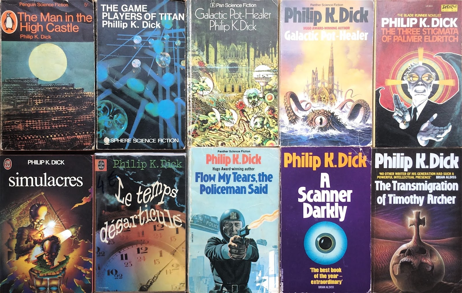
The Misleading Book Covers of Philip K. Dick

Though today widely admired for their psychological complexity and visionary insights, the novels of Philip K. Dick were published in his lifetime as standard science fiction. That is to say, cheaply and with no regard to the artwork – the generic formula of ray-guns, rocket-ships and space-battles was applied indiscriminately to his work. In the late 1950s, his first books were issued in then-popular double editions; two novels ‘back-to-back’ with interchangeable artwork by anonymous artists. Even when published individually, their packaging remained in the cost-saving pulp tradition, as befitted their status as genre fodder in the years before Dick’s critical acclaim. This applied to the UK as well as the US paperback industry, with British imprints such as Granada and Grafton, Pan and Panther turning out re-issues using the same regulation artwork.


While the pulp SF market was resistant to change, having employed the same methods successfully since the inception of the genre, Dick’s work gradually gained more literary credibility, especially in Europe. The production values of several foreign-language editions suggested an attempt to capture some of the depth which critics were beginning to detect. By the end of the 1960s and early 70s, though Dick himself had already written the bulk of his novels, the seeping of the counter-culture, the esoteric and the experimental, into the mainstream was apparent. The influences of pop-art, psychedelia and surrealism began to be manifested on book covers, with Philip K. Dick ripe for such treatment. The US Daw edition of 1965’s The Three Stigmata of Palmer Eldritch, a favourite of John Lennon’s, is a classic of its type; no wonder the German translation of the same book was rendered as LSD-Astronauts


Sadly Dick died in 1982, on the cusp of wider recognition, shortly before the release of Blade Runner brought his work to a whole new audience. Based on his 1968 novel Do Androids Dream of Electric Sheep?, the film’s success gave rise to an ongoing succession of lavish Hollywood adaptations. From Total Recall to Minority Report, several of the novels and stories which inspired them have since been given the ‘movie tie-in’ cover. Richard Linklater’s 2006 film of A Scanner Darkly, an ambitious ‘rotoscope’ animated version of Dick’s dystopian vision of societal breakdown and drug-induced paranoia, was also issued as a graphic novel. However, since his death, few publishers have surely even considered issuing Philip K. Dick’s novels with illustrations of rocket-fire and spaceships.


Tuesday, 27 March 2018

SF History in Leeds, Scriven Bolton and Space Art

Thomas Simeon Scriven Bolton (1883-1929)
For this month’s post I decided to return to the theme of SF history in Leeds and the work of former Leeds resident Thomas Simeon Scriven Bolton (1883-1929). Bolton was a commercial illustrator and amateur astronomer, who lived in Bramley with his family from 1911.

As an illustrator, he specialised in astronomical subjects, also known as space art. Space art covered a range of drawing styles: illustrations of astronomical phenomena reproduced from telescopes; technical illustrations with overlaid graphics and text; and imagined planetary or lunar landscapes. Bolton produced all three kinds of illustrations and these were published in a number of newspapers, magazines and books in both the UK and North America.

Clive Davenhall, who has written an extended essay on Bolton’s art, suggests that he introduced several innovations into the field and describes his technique as follows:

Bolton developed an effective method for producing realistic lunar landscapes that involved making a model of the surface in plasticine or similar material, photographing it and then painting over the photograph. This approach was a development of the technique of modelling the lunar surface and photographing it under oblique light.

Being an amateur astronomer, Bolton also published many of his astronomical observations in science journals such as Nature and the Journal of the British Astronomical Association.

A lunar landscape by Bolton using the technique described above.

However, the SF connection can be found in Bolton’s work for magazines such as Popular Science. These types of publications tended to focus on topics of popular interest in astronomy, and on speculations about imagined worlds, planetary surfaces and undiscovered moons.

Bolton’s work thus shares affinities with the writings of SF fans and scientific enthusiasts, discussed previously on this blog, who saw their speculations as contributing to and advancing the sciences, particularly in the field of cosmology. A more detailed consideration of this topic is available here.

Monday, 26 January 2015

Covers Without a Cause: SF Cover Illustrations

To complement the surreal selection of 70s SF album covers from earlier this month, I decided to post on SF book covers... with a twist. The titles I’ve chosen are ones where the subject depicted on the front of the book has little, if any, resemblance to the story of the novel. It’s a problem that’s plagued pulp fiction generally but particularly SF; the mass production of cheap books from the 1940s onwards demanded a high turnover of titles, with publishers’ in-house artists usually working to a brief following the established formula of spaceships and aliens. However, the passage of time has given some of these books a certain charm, or at least enough entertainment value to raise a smile.

The three covers featured here are a somewhat piecemeal selection, and the tip of the iceberg in terms of the SF genre but a good starting point that will perhaps spawn a sequel post. Here goes...


1. Dagon and Other Macabre Tales by H.P. Lovecraft. Highly influential in the SF, fantasy and horror genres, the stories of Lovecraft offer plenty of terrifying visual fodder, or so you might think. The cover design for this Mass Market Paperback edition (1985) of his collected short stories shows an odd, brown scaly creature (not, to my memory, resembling anything in the stories) sitting on top of an unconvincing pile of disembodied heads. Maybe the artist assumed the title was a typo, since the creature’s appearance is definitely more dragon than Dagon.


2. The Hospital Ship by Martin Bax. The first (and only?) novel by the writer and consultant paediatrician, Bax’s experience as a doctor informs this tale of post-apocalyptic societal collapse. The hospital ship of the title sails around picking up casualties of recent wars, a futile undertaking that does little to mitigate the impending global disaster. Clearly, it’s a gloomy theme, and one that could use some help exciting a reader’s attention. So it’s the old sex sells cliché that kicks in for the Pan Books edition (Picador imprint, 1977). Even allowing for the tenuous link to the practice of ‘love therapy’ in the novel, the cover (and the covergirl) are pretty wide of the mark. And if you bought the book for the cover alone, you were bound to be disappointed with the contents.


3. The Caltraps of Time by David I. Masson. The writer and former Curator of the Brotherton Collection (University of Leeds) was the subject of a former post, in which you can read more about his life and this, his only published collection of short stories. Suffice to say, these tales of curious features of language and temporality are not well served by the book cover in this New English Library edition (1976). It is, of course, a classic case of ‘safe SF design’ (when in doubt, draw a spaceship). I’m sure it saved many a tortured conversation about how to visually represent time, phonology or linguistics but it doesn’t do justice to the original and inventive themes in the stories.

Tuesday, 25 February 2014

The Reader Speaks

In June last year (see my Digital Library post), I publicised the Amazing Stories and Wonder Stories covers by Frank R. Paul, available to view via the University of Leeds' Digital Library.

In that post, I mentioned that Paul's distinctive style became closely associated with these and other Hugo Gernsback publications. Now more than six months later I wanted to follow up with another Paul-related interest story by going beyond the covers of the magazines and into the obsessive, paranoid, and often downright strange territory of readers' letters. Most of these early pulps had a section devoted to readers' letters and the SF magazines were no different. 'The Reader Speaks' was a forum for fans to show their appreciation, or consternation, at the stories featured in each issue. But it was a letter from a Morris Miller of Brooklyn, NY, in an edition of Wonder Stories from January 1934 that drew my attention, primarily for its subject matter:- the artwork of Frank R. Paul. In his letter, Miller writes:

The attractive cover of the November issue depicts most remarkably the superb ability of its creator, Frank Paul, whose work, by the way is becoming less fantastic and more convincing, as well as within the bounds of reason. But I hate to have to see him draw an insensible picture like the one which appeared on the May 1933 cover. I hope the editors try their best to avoid such absurd means of arousing wonder in those not acquainted with our mag. I guess that is about all it can do. I also note the much improved lifelikeness in the faces of characters drawn by Mr Paul.

This is not the only topic covered in the letter, of course; there's a summary of the reader's favourite stories, a request for a science news section and speculation about the existence of canals on Mars:- 'perhaps they are not canals but some other super-structures which may account for everything...' However, the editors make it their first priority to address the comments relating to the cover artwork, responding with:

You seem to like our covers, like the majority of our readers, but there are a few who claim that they are too ‘gaudy’ or ‘loud’. We do not deny the fact, but we do say that it is necessary in order to have a newsstand sale. These covers are very attractive and draw the eye of passers-by, who may be persuaded to buy the magazine because of this fact, and thereby we acquire many new science-fiction fans who would not now be acquainted with the magazine if it weren’t for this. If we took a vote, we’d probably find that a large percentage of our readers were introduced to science-fiction by the cover of Wonder Stories.

Here, a debt is acknowledged to Paul's covers for drawing the eye and exciting interest in a potential 1930s SF reader. It's easy to imagine how these distinctive images would stand out on a crowded newsstand but perhaps this would be small comfort to a reader like Miller. The oddest thing is that a comparison of the 'attractive' November issue and the 'insensible' May issue reveal (to my eye) few discernible differences, although I could be missing something. For a man that can make sense out of canals on Mars, maybe a robot with tentacles is not too much of an imaginative stretch. But a flying man? That's evidently a bridge too far...


Insensible May issue
Attractive November issue


Wednesday, 22 January 2014

The Guardian's Art from Mars

Photo: NASA/JPL-Caltech/Texas A&M/Cornell

This beautiful feature from the Guardian represents the best pictures sent back from NASA rovers Spirit and Opportunity, over a decade spent photographing Mars.

From dazzling dunes to vast craters to space blueberries, these amazing shots are full of imaginative possibilities and offer a glimpse of life on the Red Planet.

Thursday, 18 July 2013

Guardian Books - Five Science Fiction Novels for People who Hate SF

Guardian Books recently featured the article, 'Five Science Fiction Novels for People who Hate SF'. This title is in-keeping with a slightly annoying tendency of some literature feature writers:- to offer a pre-emptive apology, assuming that readers will be automatically put off by the SF label.

But is this really reflective of what people think? So often has the well-worn, albeit legitimate, argument about SF's resonance with societal issues been stated that it seems contrived to make it the opening gambit of the article. Nevertheless, we are told, 'science fiction is all around us, from clandestine electronic surveillance to robots taking our jobs', echoing J.G. Ballard's 1971 observation that, 'everything is becoming science fiction. From the margins of an almost invisible literature has sprung the intact reality of the 20th century'.

In this case the writer, Damien Walter, is obviously an SF fan, so the early disclaimer is soon forgotten because of his evident enthusiasm for the genre. His picks are:

5. China Mountain Zhang by Maureen F. McHugh
4. The Player of Games by Iain M. Banks
3. The Left Hand of Darkness by Ursula K. Le Guin
2. Pattern Recognition by William Gibson
1. The Sparrow by Mary Doria Russell

Le Guin's exploration of gender and race issues, Gibson's prophetic vision of the disturbing progress of technology and Banks' end-of-history based adventure story offer plenty for readers to get their teeth into. All things considered, this list is less 'Five SF Novels for people that hate SF', and more five novels for those that enjoy reading (less catchy, I know!) That being said, I recently joined a book group where the first novel we read will be my suggestion of The Female Man by Joanna Russ. It'll be a good opportunity to find out if the old sterotypes about SF come out in a group of voracious, library-based readers. Watch this (outer)space...

UPDATE: November 2015

Apparently others have also found critics' separation of literary and genre fiction frustrating. See the following articles in The Guardian and The Norwich Radical:

https://thenorwichradical.com/2015/11/03/literature-vs-genre-seconds-out-part-1/

https://www.theguardian.com/books/booksblog/2015/nov/10/david-mitchell-and-literary-and-genre-fiction-world-fantasy-award