
There were some also fascinating SF connections made in relation to the William Gibson short story The Gernsback Continuum, which I'd never come across before. Hugo Gernsback, the writer, inventer and SF magazine publisher, has featured more than once on this blog, so the title of the story immediately piqued my curiosity. The story is told in the first person, from the perspective of a US photographer, who's commissioned by a British 'trendy trade paperback publisher' to photograph examples of futuristic American city architecture of the Thirties and Forties. It transpires that this book project - working title The Airstream Futuropolis: The Tomorrow That Never Was - is the brainchild of fashionable pop art historian Dialta Downes. The narrator's mild contempt for the idea is evident in his initial encounter with Downes:
There’s a British obsession with the more baroque elements of American pop culture [...] In Dialta Downes this manifested itself in a mania for a uniquely American form of architecture that most Americans are scarcely aware of. At first I wasn’t sure what she was talking about, but gradually it began to dawn on me [...] She was talking about those odds and ends of ‘futuristic’ Thirties and Forties architecture you pass daily in American cities without noticing: the movie marquees ribbed to radiate some mysterious energy, the dime stores faced with fluted aluminium, the chrome-tube chairs gathering dust in the lobbies of transient hotels. She saw these things as segments of a dreamworld, abandoned in the uncaring present; she wanted me to photograph them for her.


The connection to Gernsback becomes clearer when the photographer is shown a collection of Downes' favourite examples of this architectural style, what she calls 'American Streamlined Moderne':
I saw a dozen shots of Frank Lloyd Wright’s Johnson’s Wax Building, juxtaposed with the covers of old Amazing Stories pulps, by an artist named Frank R. Paul; the employees of Johnson’s Wax must have felt as though they were walking into one of Paul’s spray-paint pulp utopias. Wright’s building looked as though it had been designed for people who wore white togas and Lucite sandals.
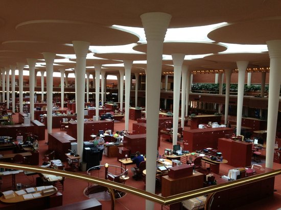 |
| Interior of Johnson's Wax Building |

Here, we see a reference to Amazing Stories, published by Gernsback, and the cover art of Frank R. Paul, an artist closely associated with this magazine's visual style, who trained as an architect himself. Downes says that we might think of these images and designs 'as a kind of alternate America: a 1980 that never happened. An architecture of broken dreams'. The narrator starts to warm up to the project, and he tries to re-imagine the environment around him according to this aesthetic:
I thought myself in Dialta Downes’s America. When I isolated a few of the factory buildings on the ground glass of the Hasselblad, they came across with a kind of sinister totalitarian dignity, like the stadiums Albert Speer built for Hitler. But the rest of it was relentlessly tacky: ephemeral stuff extruded by the collective American subconscious of the Thirties, tending mostly to survive along depressing strips lined with dusty motels, mattress wholesalers, and small used-car lots. I went for the gas stations in a big way.

As the photographer tunes in more and more to this 'shadowy America-that-wasn’t', the images begin to take on real forms, a phenomenon his journalist friend Kihn calls 'semiotic phantoms, bits of deep cultural imagery that have split off and taken on a life of their own'. Driving back to Los Angeles, he reflects on this explanation but it troubles him and, exhausted and agitated, he pulls over the car to sleep. Upon waking, he finds a phantom futuristic city looming before him; this is the ekphrastic element Richard highlighted in his talk:
Then I looked behind me and saw the city. The books on Thirties design were in the trunk; one of them contained sketches of an idealised city that drew on Metropolis and Things to Come, but squared everything, soaring up through an architect’s perfect clouds to zeppelin docks and mad neon spires. That city was a scale model of the one that rose behind me [...] You could hide the Empire State Building in the smallest of those towers. Roads of crystal soared between the spires, crossed and recrossed by smooth silver shapes like beads of running mercury. The air was thick with ships: giant wing-liners, little darting silver things (sometimes one of the quicksilver shapes from the sky bridges rose gracefully into the air and flew up to join the dance), mile-long blimps, hovering dragonfly things that were gyrocopters...
Even more troubling is the appearance of a couple, 'white, blond', the 'children of Dialta Downes’s ’80-that-wasn’t', framed by the illuminated shadow city. The narrator imagines the city populated by these creatures 'orderly and alert, their bright eyes shining with enthusiasm for their floodlit avenues and silver cars', deciding 'it had all the sinister fruitiness of Hitler Youth propaganda'.
The photography for Downes' book ends up being a great success. But, desperate to return to some kind of normality, the story ends with the photographer rushing to the nearest newsstand to buy a paper and read about the petroleum crisis and the nuclear energy hazard:
[Newsstand proprietor] ‘Hell of a world we live in, huh?’ [...] ‘But it could be worse, huh?’
‘That’s right,’ I said, ‘or even worse, it could be perfect.’
Overall then, Gibson takes a cynical view of the technophilia and optimism of the 1930s and 1940s, epitomised in the covers of Gernsback's SF magazines. As Bruce Sterling has commented, 'The Gernsback Continuum shows [Gibson] consciously drawing a bead on the shambling figure of the SF tradition'. Nevertheless, his evocative rendering of the 'semiotic phantoms' lurking in American architecture throws a sharp critical and visual lens on one of the country's many futures past.


